
The Actual Size Of Each Country
Have you ever looked at the World Atlas and wondered how some countries got so big and others are so tiny? Have you ever wondered how many of those tiny countries could be fit into those big countries? I have.
You already know that our world, planet earth is a globe. Have you ever considered how these countries and landscapes on a globe were marked up in a two-dimensional map? How this “globe to flat” surface conversion was done? In this article, we look into this and you will get to know about the “Mercator Projection”, it’s advantages, benefits, how it makes naval navigation so easy and all the tricks and illusions that comes with it.
Trade Needed Effective Navigation
As the Constantinople (Byzantium), fell to the raiders from the east, the national economies in the European kingdoms were struggling without profitable and consistent trade relations with the East. This ultimately led the Europeans to look for new ways and naval routes to reach Asia to trade once more effectively and profitably with the oriental nations.
Unlike navigating when on land, naval navigation was extremely difficult often led the navigators to confuse, this difficulty was commonplace during long voyages and the risks magnified during unwelcoming weather conditions.
Absence of an accurate map that is precise in detail to find route was the main point that gave rise to these complexities. It was because of this the Mercator Projection was designed.
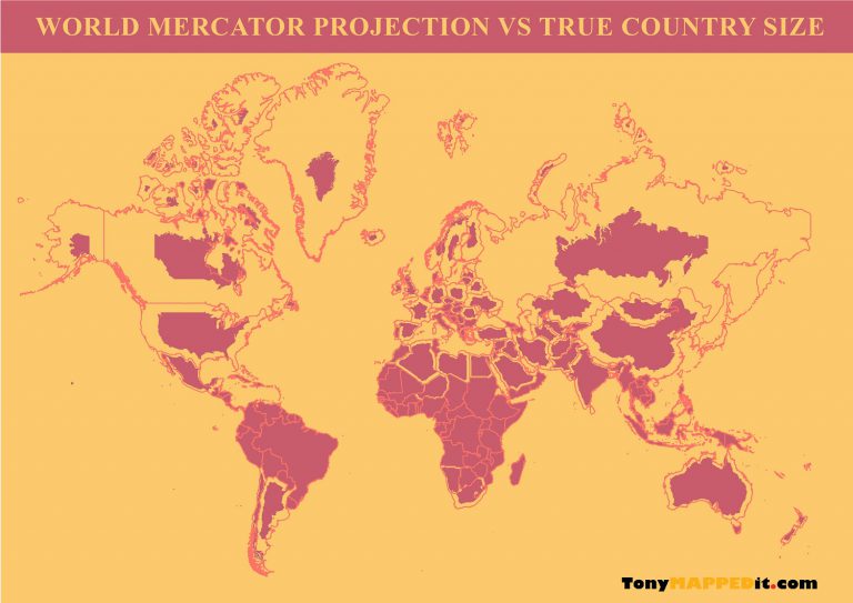
Designed by the geographer and cartographer Gerardus Mercator in 1569 A.D, Mercator projection is simply a cylindrical map projection that represents the “earth globe” in a two-dimensional map. What must be noted is that when the conversion is done from the globe to the flat surface, the east-west stretching is unavoidable. The north and south are stretched as well to compensate for the east-west extension so that at every point the east-west scale is as same as the north-south scale. These are called “conformal scales” and conformal projections preserve angles around all locations, making it ideal for accurate navigations. But the accuracy comes at a price, and that is the scale distorts the size of actual countries far from the equator (because of the east-west, north-south stretch).
The True Size Of Each Nation
All the nations that are close to the equator are unaffected by the Mercator projections stretch effect, yet the nations that are closer to the north and south poles are enlarged excessively than their actual size and their sizes are exaggerated on the world map.
The Largest Countries In The World
The following are the largest countries in the world, measured by square kilometers.
- Russia: 17.1 million
- Canada: 9.98 million
- USA: 9.63 million
- China: 9.6 million
- Brazil: 8.51 million
- Australia: 4.4 million
- India: 3.29 million
- Argentina: 2.78 million
- Kazakhstan: 2.72 million
- Algeria: 2.38 million
When you look at these nations on a standard world atlas, you’ll often see they are bigger than even continents, especially Russia and Canada, but now let us take a look at the sizes of the continents in the world.
- Asia: 44.579 million m2 km
- Africa: 30.221 million m2 km
- North America: 24.709 million m2 km
- South America: 17.840 million m2 km
- Antarctica: 14 million m2 km
- Europe: 10.180 million m2 km
- Australia: 8.525 million m2 km
You can see from this comparison clearly that Africa is much larger than Russia or Canada, as opposed to how they appear bigger than the African continent under the Mercator projection. However, Russia indeed is bigger than continents Antarctica, Europe, and Australia. Canada, the USA, and China too are bigger than the continent of Australia yet smaller than the rest of the continents.
Russia compared to Africa, is nearly 2 times smaller. You can see that in the above size descriptions. In addition, although the USA looks much bigger in the Mercator projection, the true size of Africa compared to the USA is nearly 3 times bigger than the USA.
Also, another striking thing you would see in the standard world map is that the island of Greenland, a gigantic landmass that is much bigger than Africa, the Americas, Australia, and Europe. Yet this too is another “illusion” of the Mercator projection and the true size of Greenland is just as the same size as the Democratic Republic of Congo, the 11th largest country in the world. (the Democratic Republic of Congo is 2.3 million square kilometers while Greenland is about 2.1 million square kilometers)
To Sum Up
It is always said that “Seeing is Believing” right? maybe, but related to the world maps, now you know for a fact that it isn’t true. The Mercator projection, while being extremely useful and accurate in navigation and positioning, distorts the size of polar regions and thus misleads the actual size of countries near to the poles of the earth.
However, despite the size distortion disadvantage, the Mercator projection still remains very useful for air and naval navigation related to economy and commerce, military navigation and positioning, etc… and will likely be in use in the years to come.
0 Comments